Multiple Axes Chart (US patent obtained)
Same as dual vertical axes chart, multiple axes chart is commonly used in data analysis and software, especially when comparing datasets with different units, to present the relation between multiple datasets in their original values, such as which dataset has increased more or less.
However, due to lack of an algorithm which can set the top scale and the bottom scale of the multiple vertical axes on such chart, many software today simply use the maximum value and minimum value of each dataset as the top scale and bottom scale of each vertical axes. The result is that all the lines are incorrectly presented as fluctuated greatly and fluctuated the same.
Case 1: Misled by multiple vertical axes chart – Which dataset fluctuated more?
| Period | A | B | C |
|---|---|---|---|
| Q1 | 100 | 100 | 45 |
| Q2 | 94 | -90 | 100 |
| Movement | -6 | -190 | +55 |
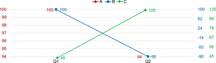
- If simply set the top and bottom scale as the max value and min value of each dataset, the chart mistakenly presents that all the datasets fluctuated greatly and the same.
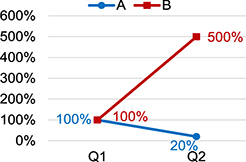
While there are other common alternative methods to present such relation, not only these methods cannot present the chart in original values, which can sometimes provide useful information such as an investor may want to sell a stock when it reaches certain price, but also these methods can present incorrect relation. For example, when using the well-known “base value method”, the method can present misleading relation if the base values of the compared datasets are very different in scale, ie. the base value of one dataset is 100 and the other is 20.
Commonly used “Base Value” method misleads too
| Period | A | B |
|---|---|---|
| Q1 | 100 | 20 |
| Q2 | 20 | 100 |
| Change | -80 | +80 |
- Line A’s decrease should be equal to Line B’s increase
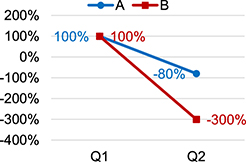
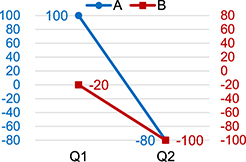
| Period | A | B |
|---|---|---|
| Q1 | 100 | -20 |
| Q2 | -80 | -100 |
| Change | -180 | -80 |
- Line A’s decrease should be more than Line B’s decrease
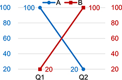
- Graphician algorithm is the only solution which can correctly present the relation between the data sets in all kinds of situations on chart.
Same as dual vertical axes chart, the only method to present the correct relation between multiple datasets is to equalize the elongation of all the compared vertical axes, which none of the software today can do.
By incorporating our scaling algorithm, chart creating software will be able to further improve the effects of visualization for multiple datasets in the big data era.
Examples of Graphician Multiple Axes Chart
Case 1: Misled by multiple vertical axes chart – Which dataset fluctuated more?
| Period | A | B | C |
|---|---|---|---|
| Q1 | 100 | 100 | 45 |
| Q2 | 94 | -90 | 100 |
| Movement | -6 | -190 | +55 |
- If simply set the top and bottom scale as the max value and min value of each dataset, the chart mistakenly presents that all the datasets fluctuated greatly and the same.
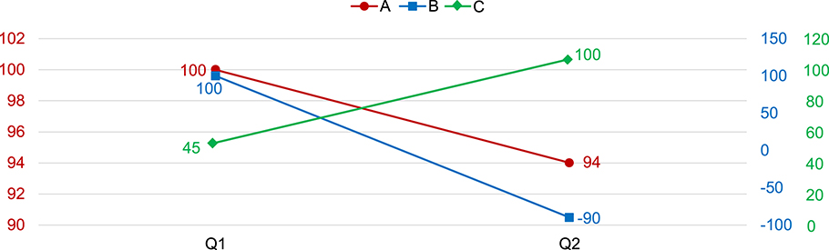
- Excel algorithm mistakenly presents the chart as the decrease of A (-6) is similar in magnitude to the increase of C (+55). And the drop of B (-190) is not much more than the decrease of A (-6).
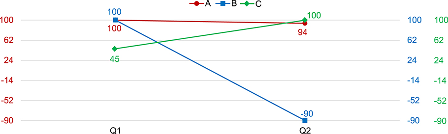
- Graphician algorithm correctly presents the drop of B (-190) is much more than the decrease of A (-6), the increase of C (+55) is in magnitude more than the decrease of A (-6), and the drop of B (-190) is also in magnitude more than increase of C (+55).
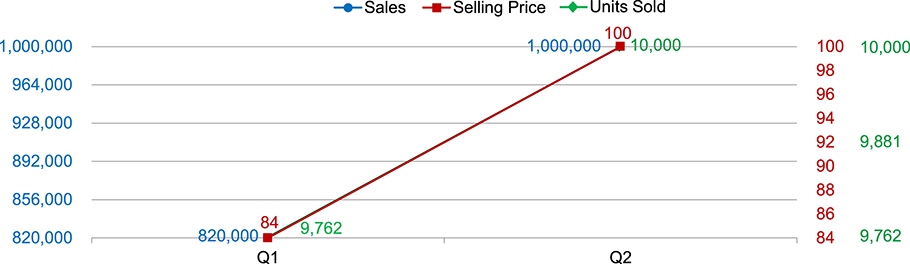
Case 2: Misled by multiple vertical axes chart – What drove the increase of sales?
| Period | Selling Price | Units Sold | Sales |
|---|---|---|---|
| Q1 | 84 | 9,762 | 820,000 |
| Q2 | 100 | 10,000 | 1,000,000 |
- If simply set the top and bottom scale as the max value and min value of each dataset, the chart mistakenly presents that all the datasets fluctuated greatly and the same.
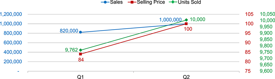
- Excel algorithm mistakenly presents as the selling price and units sold both increased, but there was no much increase on sales.
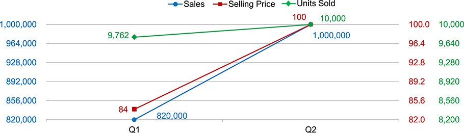
- Graphician algorithm correctly presents the fact that the main driver of increased sales was the increased selling price.