AGH Chart (US/TW/CN/HK patent obtained)
In statistics, one of the key information from a statistical plot, such as scatterplot or histogram, is the central tendency and the dispersion of the subject sample, which leads to what model or tool should be adopted for further analysis.
However, when the number of available data is few, these traditional statistical plots will not be able to present useful information. Such problem is especially common when analyzing financial statements or macro-economic data which are normally only published semiannually or quarterly.
Therefore, AGH chart was invented to provide a solution that can still present such characteristic of a sample when there is only few data available. Furthermore, AGH chart can present the central tendency and the dispersion of different datasets for comparison in one chart.
“A”, “G”, and “H” refers to “Arithmetic mean”, “Geometric mean” and “Harmonic mean”. AGH chart leverages on the mathematical features that arithmetic mean is greatly affected by large outlier(s), harmonic mean is greatly affected by small outlier(s), and geometric mean presents a more reasonable central tendency of a dataset when there is any outlier in the dataset.
AGH chart not only can present the “central tendency” of each dataset but also can present the “dispersion” of each dataset, through the difference between the arithmetic mean and the geometric mean (defined as d1 in below chart), and the difference between the geometric mean and the harmonic mean (defined as d2 in below chart). Larger d1 or d2 indicates greater dispersion of the dataset.
In addition, through further dividing “A”, “G”, and “H” by “G”, AGH chart can further compare the dispersion of the datasets in different units or scale in one chart as “normalized”, since the original units or scales of the datasets are removed.
Mathematical features of A , G, H
| A: When all data is equal |
| Dataset / NO. |
1 |
2 |
3 |
| Ai |
17.00 |
17.00 |
17.00 |
| GA |
17.00 |
|
|
| ∣Ai-GA∣ |
0.00 |
0.00 |
0.00 |
| Σ∣Ai-GA∣/ 3GA |
0.00 |
|
|
| B: When data are close but not equal |
| Dataset / NO. |
1 |
2 |
3 |
| Bi |
23.00 |
18.00 |
13.00 |
| GB |
17.52 |
|
|
| ∣Bi-GB∣ |
5.48 |
0.48 |
4.52 |
| Σ∣Bi-GB∣/ 3GB |
0.20 |
|
|
| C: When outlier is particular large |
| Dataset / NO. |
1 |
2 |
3 |
| Ci |
70.00 |
9.00 |
8.00 |
| GC |
17.15 |
|
|
| ∣Ci-GC∣ |
52.85 |
8.15 |
9.15 |
| Σ∣Ci-GC∣/ 3GC |
1.36 |
|
|
| D: When outlier is particular small |
| Dataset / NO. |
1 |
2 |
3 |
| Di |
51.00 |
50.00 |
2.00 |
| GD |
17.21 |
|
|
| ∣Di-GD∣ |
33.79 |
32.79 |
15.21 |
| Σ∣Di-GD∣/ 3GD |
1.58 |
|
|
Here we use the distance between each data and its geometric mean to calculate the dispersion of the dataset, because
- standard deviation assumes the data is normally distributed and;
- geometric mean is a more accurate indicator of central tendency when outlier exists.
And by dividing by its geometric mean, dispersions of different dataset can be compared as the original units or scales are removed.
Dispersion of Dataset: D > C > B > A
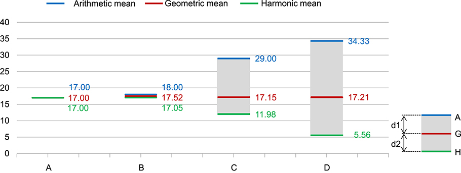
Graphician AGH chart: Original unit
AGH chart shows that:
-
The geometric means of these 4 datasets, which indicate the central tendency of a dataset, are all close to 17, but the dispersions of these 4 dataset are quite different.
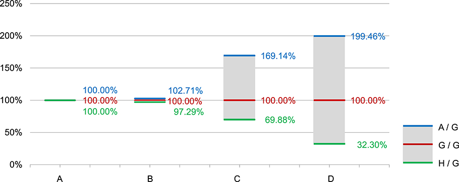
Graphician AGH chart: divided by Geometric mean
AGH chart shows that:
- Dispersion of Dataset: D > C > B > A, the same order as the calculated dispersion.
Real life application examples of Graphician AGH Chart
Which company had higher and more stable Interest Coverage Ratio?
Historical Interest Coverage Ratio (“ICR”)(1)
| Year / Company |
A |
B |
C |
D |
| 2006 |
63.58 |
26.40 |
67.37 |
26.51 |
| 2007 |
43.46 |
30.00 |
66.28 |
31.19 |
| 2008 |
36.65 |
99.66 |
22.08 |
9.62 |
| Σ∣Xi-Gx∣/ 3Gx |
0.2151 |
0.6695 |
0.4717 |
0.4695 |
| Mean / Company |
A |
B |
C |
D |
| Arithmetic |
47.90 |
52.02 |
51.91 |
22.44 |
| Geometric |
46.61 |
42.90 |
46.20 |
19.96 |
| Harmonic |
45.44 |
36.92 |
39.88 |
17.27 |
Dispersion of Dataset: B > C > D > A
- Note:(1)
- Interest coverage ratio = Earnings Before Interest and Tax / Interest Expenses; higher Interest coverage ratio means the company has more sufficient earnings to pay its interest expenses and thus better from the finance point of view.
Graphician AGH chart: Original unit
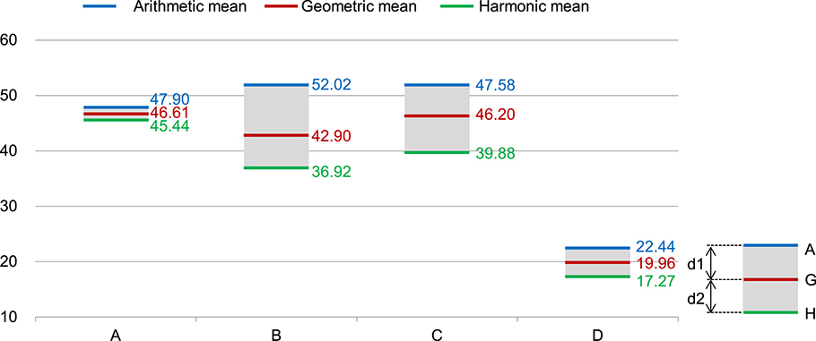
| Mean / Company |
A |
B |
C |
D |
| Arithmetic |
47.90 |
52.02 |
51.91 |
22.44 |
| Geometric |
46.61 |
42.90 |
46.20 |
19.96 |
| Harmonic |
45.44 |
36.92 |
39.88 |
17.27 |
| Ratio / Company |
A |
B |
C |
D |
| A / G |
102.76% |
121.27% |
112.37% |
112.41% |
| G / G |
100.00% |
100.00% |
100.00% |
100.00% |
| H / G |
97.48% |
86.08% |
86.33% |
86.50% |
AGH chart shows that:
Company D had the lowest ICRs.
-
Through dividing all 3 “A, G, H “means by its own geometric mean, the AGH chart can further present the dispersion of each company’s ICRs as they are “normalized” since the original scales of each dataset are removed.
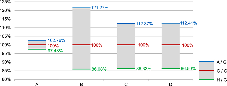
Graphician AGH chart: divided by Geometric mean
AGH chart shows that:
- Dispersion of Dataset: B > C > D > A, the same order as the calculated dispersion.
- Company B’s ICRs were the most fluctuated one among these 4 companies.
- We can conclude that Company A had better and more stable ICRs.